Today I would like to share how I usually CSS code a website without a pre made Photoshop design of the website. This is just the workflow that I usually follow and I hope you will enjoy my post 🙂
The software

CSSedit
I usually use CSSedit because this is the software that allows me to code CSS the fastest. Through out this article, you will get to see what this software can do.
If you are not using CSSedit, I recommend that you work with either Safari or Chrome in your CSS projects, this can save you a lot of hassle when you check other browsers later on.
Coding the theme core
So what I usually do is code my WordPress theme or website theme in PHP & HTML first. I layout everything properly in divs without worrying about CSS.
Base CSS

CSSedit's override function. Just open any website in the live preview and you can now override any CSS on the fly!
Every good website need at least 2 starting CSS file. You need a reset.css, this is basically a bunch of CSS codes that tells every browser out there to behave the same. You will spend less time writing different codes for other browsers if you have a good reset.css.
Get your reset.css from either of these coders, that or write your own. Its just a one time thing. 🙂
After throwing in the reset, you need your base CSS. By saying base, it means you need the essentials to style all the common attributes for today’s web. You may want to have different ones for certain CMS like for instance if you are on WordPress, you need to include styling for their post gallery and sticky posts.

An example of the base CSS that you can use to start up your CSS project each time
This would be good enough to start you on any CSS project, try not to be too specific when it comes to this or else it will be hell of a ride to customize them. Keep them light with only some font styling and floats. As long as they are easy to change.

Don't forget to include base CSS for form styling

Live Preview on the left, Style.css override on the right
Once you are proper, you can fire up CSSedit and open up your live website on the left (in this case, art.hazelong.com) and override the main CSS file that you want to change. The funky thing about CSSedit is as you code, you can see the website transform automagically!
As you can see, the website is now very bare but it looks simple enough for us to work on.
Headings is important
Each topic comes with a set of Covered CSS elements that you can research and learn more about them before you continue.
Covered CSS elements :
- font-family
- font-size
- line-height
- H1,H2,H3,H4,H5
First thing I like to do is establish the mood for the website, since we do not have a design to go with this time. The very first thing is to give it a nice font for all the headings and body text. This can determine the direction of the design.

Instant fonts for your website
It’s 2011, unless you are still stuck in 2005 you can continue to use SIFR or images for fonts but all the cool dudes are using Google Font Api now. Make the switch!

Decide on the fonts and the design that you are going for.
This is what I get after I have decided on the font families. I am not too worried about size or colors yet.
Position & Size makes everything nice!
Covered CSS elements :
- position
- width, min-width, max-width
- vertical-align
- display
- *not recommended : height, min-height, max-height
- overflow
- float
- clear
- padding
- margin
- font-size
Next comes the fun part. Push your divs up, down, left, right to get the layout that you want. Amend your code to allow for further CSS customization if need be.

At this stage, I only worry about positioning and making sure everything is the correct size.
I don’t really care about colors for now but I block in some colors to get the feel that I want. I may change everything in the next step. Note that the number 5 in red aligns with the picture’s top. This is all about alignment, top, middle or bottom. Pick one that makes the design look clean.

Generous padding around text doesn't hurt your users' eyes
Learn the difference between padding and margin. I usually have a rule when I am working with paddings, I don’t declare padding on elements that has a declared width. This prevent a lot of browser conflicts with their different rendering of box-model.
Don’t do this :
[css]div{width:500px; padding:20px}[/css]
Do this instead :
[css]div{width:500px;}
div #element-inside-div{padding:20px}[/css]

Buttons and links are given the proper padding and sizing. Grid layouts have to have the same margin horizontally and vertically
I repeat this for all pages and make sure everything is in order before I continue to the next step. Here is a list of troubleshooting that might help you :
- My floats fuck things up! Read more about overflow:hidden
- I don’t know how to align elements! Read more about display, position:relative and use margin to push things to the desired position.
- How do I get things to center? Read more about margin:0 auto; vertical-align and text-align
- My design looks messy, why? The more things that align together, the less messy your website will look. Be pixel perfect. Get x-Scope to help.
Pretty things and CSS3
Covered CSS elements :
- background-image, background-repeat, background-repeat
- color, backgound-color
- border
CSS3 generators that you will love:
- Rounded corners // border-radius
- Background Gradient // via background-image
- Text Shadow // text-shadow
- Other Shadows // box-shadow

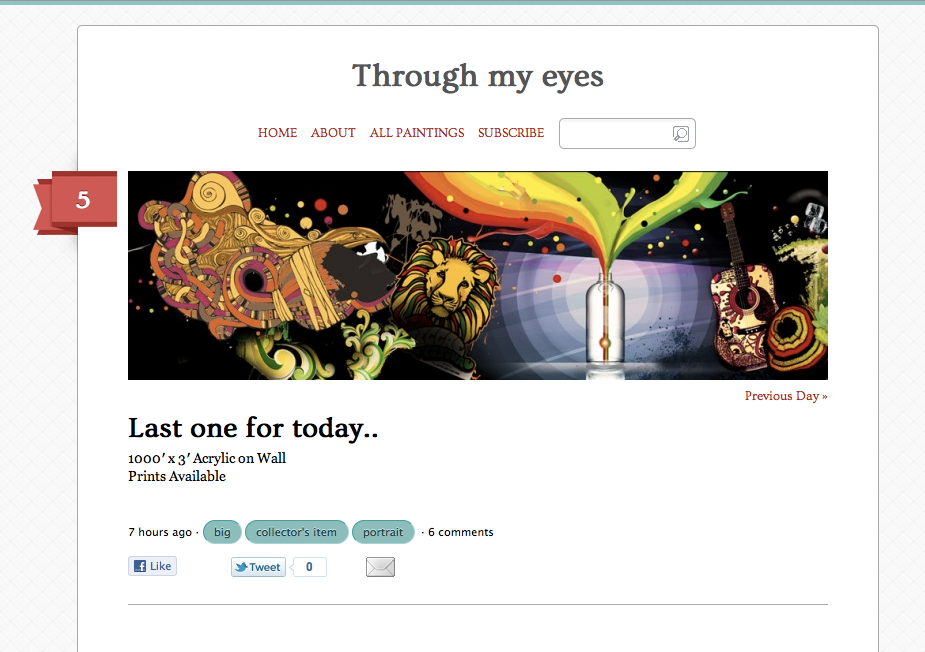
Note the icons for the search bar, email icon in the social sharing area and the number 5 background
Icons and background images do a hell lot of difference. The first thing you gotta do is throw in a background image and then work on your icons. This is where you finalize your design, I have decided to change the Heading’s font. Pick a color scheme and stick to it. This is the final round.
Icons are all lumped into ONE single png file. (Yes you need the PNG fix plugin/script)
Before you save your icons separately one by one, note that the standard now allows us to put everything into one file, I usually call this the sprite.png. Loading this one time is better than requesting every single icon or background image. To use this file, you have to set the background-position so that the correct icon shows up.
[css]#element{background-image:/sprite.png;
background-repeat:no-repeat;
background-position: 30px 120px; /* this finds the correct icon */ [/css]

Buttons and background images clean up the design
Now it is also time to do all the CSS3, so put in all the rounded corners and gradients that you want.

This current stage is also the only set of codes you need to change when you want to revamp your website according to trend.
All these pretty stuff are dependent on trend, doing this at one go with one group of CSS separate from the positioning CSS makes it easier to change and amend when you decide to give your website a haul next time.
The Polishing and Finishing
This is the deciding step that separates the awesome design from the good design. You need user friendly stuff and also some easter eggs here and there. For this step, you need to learn jQuery, HTML5 or master CSS3 animation properties. Finishing touches does what it is called, it finishes a piece of creative work. If you skip this part, your design will lack the funk that it needs to have.

Clicking on the form's input selects it and gives it a glow. (from Twitter trend)
This is very subjective and depends on what you like after browsing the net every day. I have my own default set of finishing touches, and I add on to them in every website.

Comment reply buttons fade in when you mouseover the comment
Because my comments list design is mostly whitespace, having a button for every comment is a huge distraction and I have decided to keep them out of the eye’s sight until the user needs them.

The longer the tag, the more popular it is
I also wanted a multicolored tag cloud that makes the tag longer the more popular it is. The trick to do this is WordPress is very simple. I love to include a scripts.php in my theme (note that it is .php and not .js) Making it .php allows my scripts to take in PHP functions. The script that I use is included here, (I am still a noob in jQuery and nuked my Switch function so I switched to if/else instead)
[php][/php]
I also sorted my tags according to the topic count to make the design look neater.

Don't forget your error pages
All done! Wait, now comes the horrid part!

Check your browser version. Omaikot I actually made a meme comic fml.
One last thing to do, browser checking. Before you open up all the browsers and key in your website link, make sure your browser is updated to the latest version.

Decide on a set of browsers and check all of them
It is usually like this, if it works on Safari it works on Chrome. If it works on Firefox, it most likely will work in Opera. Check all the forms, positioning and font-size. You can even be an anal ass by making screenshots of all of them and then layering all of them with the Difference blending mode in Photoshop. I don’t do that, but if you want to be my guest.
Since I work on Safari, Chrome plays nice with my website and I only need browser specific CSS for Firefox and Opera. This is the code that you will need to fix your CSS.
[css]
/*–Firefox–*/
@-moz-document url-prefix() {
/* your css here */
}
/*–Opera–*/
@media all and (-webkit-min-device-pixel-ratio:10000), not all and (-webkit-min-device-pixel-ratio:0){
/* your css here */
}[/css]
What is next after this? After this, you will need to code a mobile theme, which will be discussed next time. Have fun coding!


Comments (2)
Wow, not bad. Cool article. 🙂
But would like to check as well, what is ur default browser? Is it IE? Becos I realise the browser checking did not comment on IE.
By far, IE has the worst CSS standardisation among its own versions, although I do think IE8/9 has been doing great.
thanks lol.. i don’t code for IE. ever! I only code for Safari, Opera, Chrome and Firefox. Decided that the web needs help in pushing things for the future.